Visa consultancy webapp — eligibility quiz, fee calculator, document portal
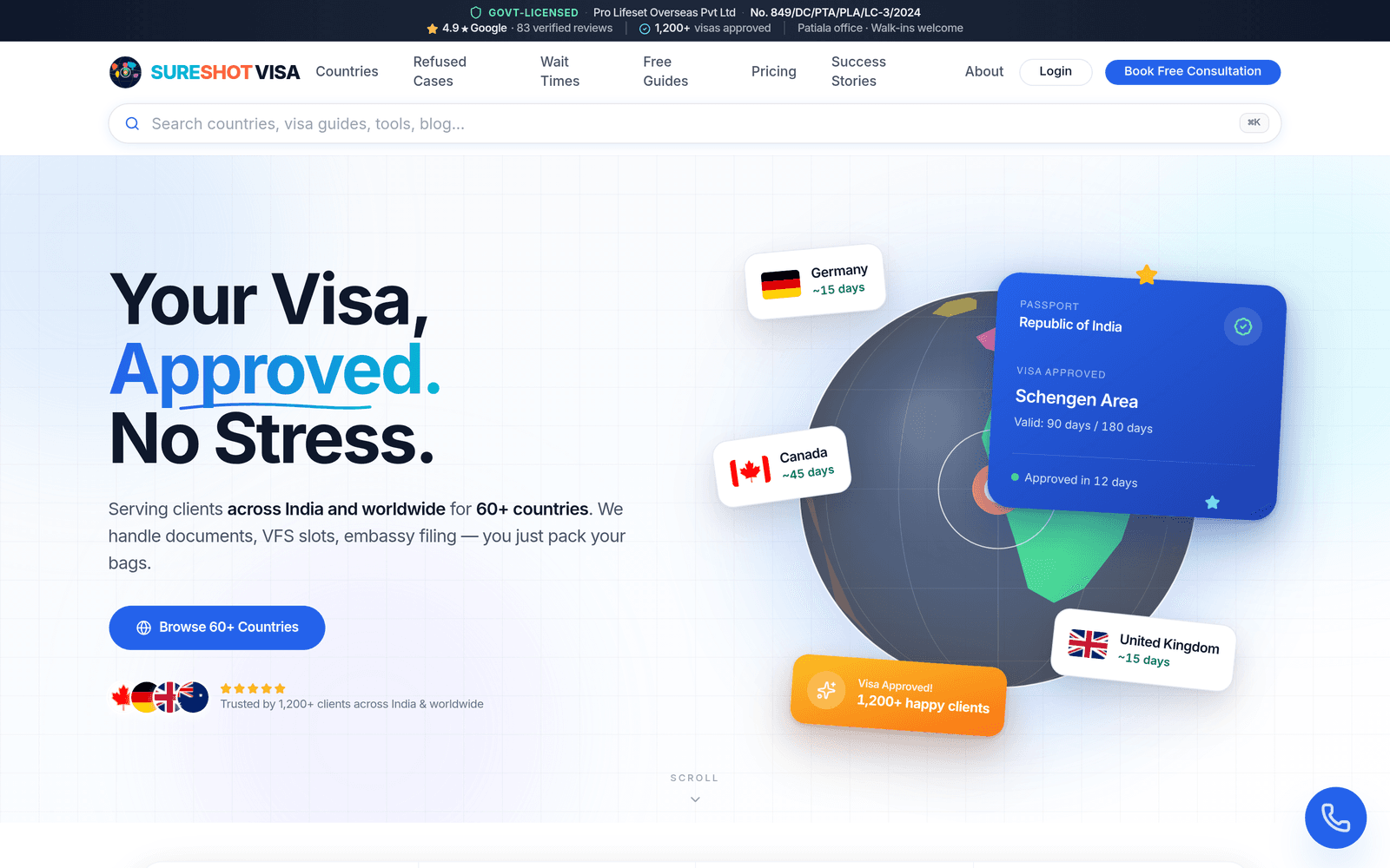
SureshotVisa is a government-licensed visa consultancy in Patiala, Punjab, serving applicants travelling from India to more than 60 destinations. When the project began the client already ran a working consultancy. What they did not have was a website that could carry the weight of the business. Most visa-consultancy sites are brochures: a hero image, a grid of country flags, a phone number. SureshotVisa needed the opposite — a site that did real work. We built it as a webapp on Next.js.
The brief
The consultancy operates in a market full of noise. Every town has an immigration "agent", and applicants have learned to be sceptical — many arrive having already been burned once. SureshotVisa's genuine edge is that it is properly licensed (Govt of Punjab licence No. 849/DC/PTA/PLA/LC-3/2024, valid to 2029) and genuinely accountable. The website's first job was to make that difference legible within five seconds. Its second job was to be useful enough that a visitor finished a real task instead of bouncing to a competitor.
Three things had to be true of the finished product. It had to qualify traffic, so consultants spent their hours on viable applicants instead of answering the same eligibility questions forty times a day. It had to be honest about money, because hidden fees are the single biggest trust-killer in this industry. And it had to support the full lifecycle of an application — not just the enquiry, but document collection and the long wait afterwards.
What made it hard
The hard part of a visa platform is breadth. SureshotVisa actively files for Canada, Australia, the UK, the USA, Germany, the Schengen states, the UAE, Singapore, Japan and New Zealand, and quotes for fifty more. Every destination has its own fee structure, document checklist and processing reality. A naive build would mean sixty hand-maintained pages that drift out of date the moment an embassy changes a fee.
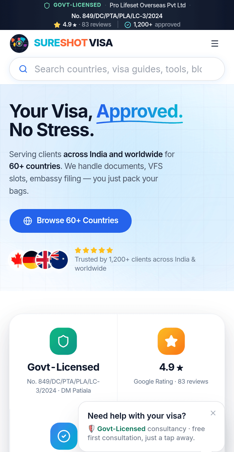
There was also an audience-shape problem. A meaningful share of SureshotVisa's visitors read more comfortably in Hindi than English, search on mid-range Android phones, and are often on metered mobile data. "Mobile-first" could not be a slogan here; it was the primary design target, with desktop treated as the adaptation rather than the other way round.
There was also a line we could not cross. A licensed consultancy is legally accountable for what it claims, so the site could not lean on the invented "99% success rate" banners that fill this market. Every number on SureshotVisa is one the business can stand behind: the licence, the registration, the genuine review count. Designing a high-converting page without the dishonest shortcuts is harder, and it was a constraint we accepted from day one.
Finally, this is a category where the post-rejection visitor matters enormously. Someone whose visa has just been refused is highly motivated, highly anxious and ready to act today. The site had to speak to that visitor directly rather than treating them as an edge case.
A webapp, not a brochure
We made an early decision to treat SureshotVisa as an application with content, not a content site with a form bolted on. That decision shaped everything downstream.
Four interactive tools form the spine of the site. The eligibility quiz lets a visitor self-assess in under a minute through a short, branching set of questions, returning a realistic read on which destinations are worth pursuing. It does the triage that used to happen on a phone call, before the visitor has spent any of a consultant's time.
The visa fee calculator is the honesty mechanism. A visitor picks a country and visa type and receives an itemised estimate in rupees: embassy fee, VFS charge, insurance, with the real ranges shown (embassy fees across destinations run from roughly Rs 2,500 to Rs 15,500). Nothing about cost hides behind an enquiry form. In an industry built on vague pricing, publishing the numbers is a deliberate competitive move.
The document portal is where an engagement turns real. After a consultation an applicant uploads passports, bank statements, invitation letters and statements of purpose through an encrypted client dashboard rather than over WhatsApp or email. Because that portal handles passports and financial documents, uploads are encrypted and access is scoped to the applicant and their assigned consultant — the same data-handling discipline we would apply to any system holding identity documents. Beside it sits a guides library with templates for the documents people most often get wrong.
The rejection-analysis tool addresses the motivated post-refusal visitor. It maps common refusal reasons to plain-language explanations and to a reapplication path, turning the most stressful moment in an applicant's journey into a clear next step, and into a qualified lead for SureshotVisa's refusal-recovery service.
Around those tools we built the support cast: a destination comparison view, so a visitor weighing "Canada vs Australia" gets a genuine side-by-side instead of two separate sales pitches; a success-stories repository with real timelines; and a knowledge hub of country-specific guides that carries the long-tail SEO.
Designing the route to a consultation
A webapp full of tools still has to convert. We anchored the homepage on a four-step process — consultation, documents, processing, approval — so a first-time visitor immediately understands what working with SureshotVisa actually looks like. Every tool has a natural hand-off into a booked consultation: the quiz ends with a recommendation and a booking prompt, the calculator ends with an invitation to discuss the quote, the rejection analyser ends with a refusal-recovery enquiry. The tools are genuinely useful on their own, and each one is also a doorway.
Trust signals are placed deliberately rather than scattered. The licence number, the company registration (CIN U52291PB2024PTC060508) and the verified-review count, drawn from a real Google Business Profile, sit high on the page, because in this category the first question in every visitor's mind is "is this real?"
Sixty countries without sixty headaches
The breadth problem we solved structurally. Rather than sixty bespoke pages, country content is data-driven: each destination is a structured record, and the page templates render from it. The eight priority destinations carry the volume and get richer, hand-tuned landing pages; the remaining fifty-plus are generated consistently from the same data layer. A fee change is a data edit, not a site-wide hunt. A new country is a new record.
That single source of truth also feeds the footer's sixty-plus country links, the comparison tool and the calculator: one data layer, several surfaces. It is the difference between a site that ages well and one that quietly rots.
Performance, language and search
Because the real audience is on mid-range phones and mobile data, we built on Next.js and deployed on Vercel's edge network so pages render fast from a location near the user. Static, cacheable content stays static; the interactive tools are the only parts that do work on demand. Hindi-language content is treated as first-class rather than an afterthought translation: the knowledge-hub guides exist in Hindi where the audience expects them.
We also added a command-palette search, the familiar Cmd-K pattern, so a visitor who already knows what they want — a specific country, the calculator, a particular guide — can jump straight to it. On a site with sixty country pages and a growing blog, search is not a luxury; it is the navigation.
The knowledge hub as an acquisition channel
A visa applicant rarely searches for a consultancy by name. They search for a problem: "Schengen visa refused", "proof of funds for an Australian student visa", "Singapore tourist visa documents". The knowledge hub is built to meet exactly those searches. Each guide is a real, structured article rather than a thin paragraph, written by people who file these applications for a living, and several exist in Hindi for the audience that searches in Hindi. Every guide routes naturally toward the relevant tool: a Schengen refusal guide into the rejection analyser, a cost guide into the fee calculator. The blog is not decoration; it is the top of the funnel, and it is engineered as deliberately as the tools it feeds.
The stack
SureshotVisa runs on Next.js with React and TypeScript, styled with Tailwind CSS and deployed on Vercel. TypeScript earns its place here specifically because of the breadth problem: when country data, fee structures and quiz logic are all typed, a malformed record fails at build time instead of shipping a broken calculator to production. The stack is deliberately modern and deliberately unexciting — nothing exotic, everything maintainable.
Where it stands
SureshotVisa today is a working visa webapp, not a placeholder. The tools qualify and quote before a consultant is involved; the portal carries the document workload; the country layer scales without manual upkeep. The site backs its claims with a visible licence and real reviews rather than the inflated approval percentages the industry is known for. It is a sister build to Lifeset Overseas — same parent company, distinct brand and positioning — and the two share one engineering philosophy: the website should carry real weight, not merely describe the business.
Inside the build

Want one of these for your business?
We ship in 7–21 days for websites and 4–8 weeks for webapps. No scope creep, no surprise pricing.